We are happy to announce the new Xomega.Net release 8.11, where your
generated Blazor apps got an awesome facelift with the latest Bootstrap 5
framework, which provides responsive and customizable layout for the
views and modern style for the Xomega Blazor components.
In addition to the default Blazor components, Xomega partnered with
Syncfusion to allow you to generate Blazor apps using powerful and stylish
Syncfusion Blazor components, including support for editable grids.
Among all the improvements, we also made it easier for you to localize the
generated Blazor apps, and introduced a framework that allows you to
control the state of the view actions from the reusable presentation layer
code.
Keep reading to learn more about these new exciting features.
Bootstrap 5 responsive layout and styles
One of the major highlights of this release is the new modern responsive
layout for the Xomega Blazor apps, as described below.
Labels on top
First thing that you will notice when generating Blazor apps with the
new Xomega.Net release, is that the labels will be placed above the
corresponding controls rather than to the left of them, as before. This
makes it easier to align the fields, and can also help you keep the same
layout for the right-to-left languages, such as Hebrew or Arabic.
In fact, the generated views no longer have separate controls for the
labels, as the labels are just a part of the corresponding
property-bound controls. The controls get the text for the label and the
access key from the bound property, which will take them in turn from
the localized resources, as you will see later. The access key gets
automatically underscored in the label to give you a visual cue.
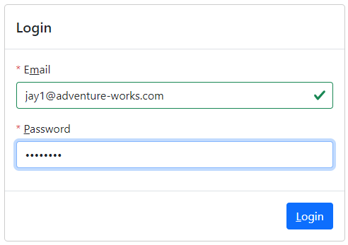
With no separate labels, the generated markup looks much cleaner, and
allows you to easily hide both the control and the label when the bound
property becomes invisible. The labels for controls bound to a required
property will automatically get a red asterisk in front of them to help
you communicate the required fields to the users.
From the screenshot above, you can also notice that the controls are now
styled using the Bootstrap 5 library, including highlighting valid fields.
Sidebar criteria and menu
Now that the labels are on top of the controls, it made sense to change
the layout of the search views to have the search criteria panel as a
collapsible sidebar rather than as a panel on top of the results grid.
In the same vein, we made the main navigation menu as a collapsible
sidebar, which allows you to show longer text in the menus, and provides
more vertical space for the actual screen.
Bootstrap 5 styled controls
We have styled all Blazor controls that were available in the
Xomega.Framework.Blazor package using the Bootstrap 5 library, and added
some new components to that package that are used in the generated views.
The most notable suearch component is XGrid, which supports multi-column
sorting and row selection. This, again, made the markup of the generated views much more readable and concise. Xomega model also allows you to customize the relative widths of the grid's columns either based on the logical types of the column's field or directly in the field configuration in the model.
Listed below are some other controls that have notable upgrades in this
release.
Tri-state checkboxes
The XCheckBox component now supports indeterminate state to represent a
null value of the bound property.

You can also display checkboxes as switches now, following the modern UI
standards.
Field validation messages
Validation messages for the property-bound controls are now automatically
displayed below the actual controls instead of being just a plain tooltip.
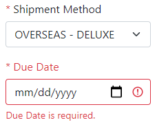
Bootstrap styling is also applied to invalid controls, highlighting them
with the red color.
XDatePicker control for entering a date or date and time is based on the
native HTML5 controls and calendars now instead of the jQuery UI.
Pick List
XPickList component for selecting multiple values from a list is now
styled with Bootstrap and looks like this.

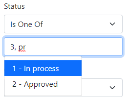
Multi-value auto-complete
We implemented the XAutoComplete control entirely in Blazor without
dependencies on third-party JavaScript libraries, with support of
multi-valued properties, meaning that it will properly show suggestions
for the value that is currently being edited.
Responsive layout
Bootstrap provides a great framework for building responsive views based
on the size of your browser window. Yet, it falls short when it comes to
dynamic views, such as master-details, where you can open or close a
details panel for the selected record on the side.
As you open a number of such views dynamically, they will be allocated
only a certain portion of the browser window, which is not necessarily
known at design time. So your statically assigned layout classes would not
work correctly, especially if you want to reuse the same view in multiple
places, e.g. both in the full screen and embedded as a details side panel.
Xomega enhanced Bootstrap’s approach to responsive layout and provided a
framework to dynamically calculate the layout classes for controls and
their containing panels, so as to ensure the desired width of the fields
as much as possible.
For example, here is a master-details screen, where the details panel is
laid out in 4 columns when open on a wide screen.
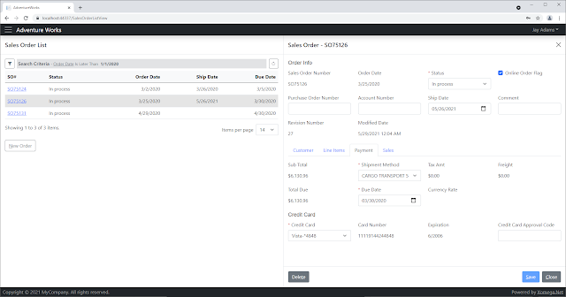
Notice that when you open the details panel on such a screen, Xomega will hide half of
the columns in the results grid on the left, instead of jamming all the
columns into half the space, or adding a horizontal scroll bar.
Presumably, you will be able to see the details on the right panel, so the
left-side grid will just need to show the key columns to identify the
rows. If you close the details panel now, you will see all the columns in
the results grid again.
However, if you try to shrink the width of the browser with the details
panel open, you will notice that it will lay out the details into 3
columns first. At a certain threshold though, instead of shrinking the
details further, it will completely hide the results grid, which will open
up more space, and we'll make the details panel go back to 4 columns.
If you continue to shrink the browser, it will be changing the layout to
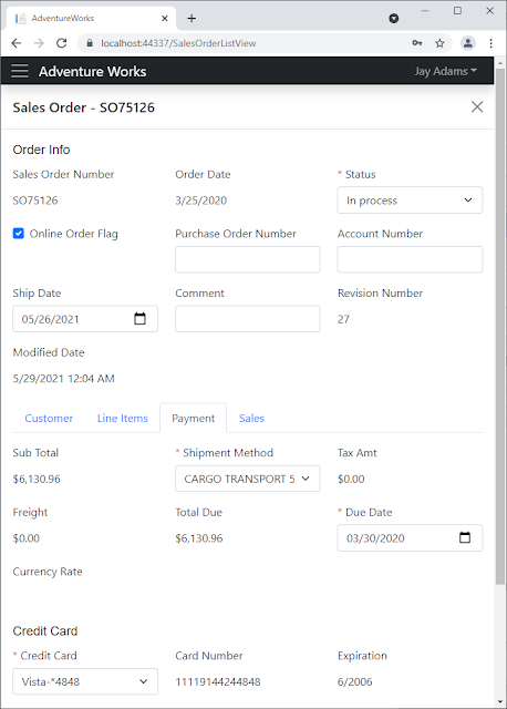
use 3 columns, 2 columns, or 1 column for the smallest devices. Here is
what this screen will look like on a smaller device, with the results grid
hidden, and the details panel laid out in 3 columns.
Customizable details views
Another great feature in the new Xomega release allows you to precisely
customize the layout of individual details panels in the generated views.
You can specify the desired maximum number of columns for the fields in
each panel, set custom titles for the panels, and indicate which child
data objects you want to lay out using tabs rather than plain panels. With
tabs, you can also specify a custom title of each tab, and with panels,
you can indicate how many columns they should be laid out within their
parent object’s panel.
The screen below shows an example of a complex custom layout for a sales
order details view. The direct fields of the sales order data object are
laid out into up to 6 columns in a top panel with a custom title “Order
Info”. The child objects are grouped into tabs right under the main panel.
The child data object Customer has in turn its main panel and the panels
of its own child objects laid out in 2 columns, and has a custom title
“Customer Info” for its main panel. The fields in its panels are laid out
in 2 columns, except for the Billing and Shipping address panels, where
they are laid out in 3 columns.

In the new version of Xomega model, you specify the custom layout
configuration for each data object under its ui:display element - both for
the layout of the main panel and for any of the child data objects.
For example, here is a configuration of the main SalesOrderObject for the
above view.
<xfk:data-object class="SalesOrderObject" customize="true">
  <xfk:add-child name="customer" class="SalesOrderCustomerObject"/>
  <xfk:add-child name="detail" class="SalesOrderDetailList"/>
  <xfk:add-child name="payment" class="SalesOrderPaymentObject"/>
  <xfk:add-child name="sales" class="SalesOrderSalesObject"/>
  <ui:display>
	<ui:fields field-cols="6" panel-cols="1" title="Order Info">
	  <ui:field param="sales order id" hidden="true"/>
	</ui:fields>
	<ui:tabs>
	  <ui:tab child="detail" title="Line Items"/>
	</ui:tabs>
  </ui:display>
</xfk:data-object>
With this new flexible per-object configuration for responsive layout, the
previous global model element ui:layout is no longer being used for Blazor
views, and only remains to be used for older technologies, such as
WebForms or WPF.
Action Buttons and Action Properties
Another awesome addition to the Xomega Framework is the ability to define
Action Properties and bind them to Action buttons on your view.
Similar to data properties, Action properties maintain the Enabled and
Visible state of the action, notify listeners of any changes in those
states, and can be added either on specific data objects or directly on
the view models, but they don’t carry any data.
This allows you to maintain the state of your actions in the
platform-independent presentation layer, such as view models and data
objects, and is especially valuable with the Blazor technology, which does
not allow you to directly manipulate the state of controls.
Action Buttons bound to reusable Action Properties
Xomega Framework got a new Blazor Bootstrap-styled component
XActionButton, which you can bind to your ActionProperty in order to drive
its enabling and visible states, as well as to set its localized label.
Here is an example of the typical Delete, Save and Close action buttons
for a Details view.
<XActionButton Action="@VM?.MainObj?.DeleteAction" OnClick="OnDeleteAsync"
               Class="me-auto"/>
<XActionButton Action="@VM?.MainObj?.SaveAction" OnClick="OnSaveAsync"
               IsPrimary="true"/>
<XActionButton Action="@VM?.CloseAction" OnClick="OnCloseAsync"/>
As you can see, they are bound to standard actions that are defined in the
framework, and the framework implements the default logic for enabling or
disabling these actions. For example, the Save action is enabled only when
the main object has been modified, while the Delete action is disabled
when creating a new object.
Note also that you don't have to provide the text for the action button,
as it gets set from the label of the bound property, but you do need to
implement the click handlers for the buttons.
Computed state for action buttons
The cool feature of Action properties, which they share with the regular
data properties, is that you can set enabling or visibility conditions as
Lambda expressions that may use the data object or its properties, and the
framework will automatically maintain the action’s state based on this
condition.
For example, the above mentioned enabling conditions for the Save and
Delete actions would look as follows.
// add save action, and make it enabled only when the object
// is modified or doesn't track modifications
SaveAction = new ActionProperty(this, Messages.Action_Save);
Expression<Func<DataObject, bool>> saveEnabled = (obj) => obj != null &&
                                   (obj.Modified || !obj.TrackModifications);
SaveAction.SetComputedEnabled(saveEnabled, this);

// add delete action, and make it enabled only when the object is not new
DeleteAction = new ActionProperty(this, Messages.Action_Delete);
Expression<Func<DataObject, bool>> deleteEnabled = (obj) => obj != null && !obj.IsNew;
DeleteAction.SetComputedEnabled(deleteEnabled, this);
This feature will make it super easy for you to write the logic for the
action states in your reusable presentation layer.
Localization of labels and titles
Xomega Framework already has support for localization of error messages
both on the server and the client sides. In the new release we added
support for the localization of other UI resources, such as property
labels and titles for various panels and views.
Resource localization
Previously all labels and titles were output directly in the generated
views using either explicit texts that you provide in the model, or ones
derived from the names of the corresponding properties or other model
elements.
The latest Xomega version includes a new generator that creates a resource
file with all these labels and titles using specific key formats, which
allows Xomega Framework to automatically use these resources for data
properties’ labels and titles for child objects and views.
The generated Blazor views now use these resource keys to look up and
output localized titles, and the updated Blazor controls use the localized
label from the bound data property, which allows you to build fully
localizable applications with little to no extra effort.
Resource customization
Xomega Framework provides a powerful CompositeResourceManager that lets
you combine resources from an ordered list of multiple resource managers,
and return resources from the first resource manager that has the
specified key. So, for instance, if you include your custom resources
before the standard framework resources, you will be able to override the
text of the specific framework error messages or labels.
Similarly, you can override resources that are generated from the model
for specific objects or properties in your custom resource file. For
example, if you want the text for the standard Save button on the
authentication form to say “Login” instead, you can override the resources
for the corresponding data object as shown below.

Syncfusion Blazor components with editable grids
Another major feature in the new Xomega release is support for Syncfusion
Blazor components, such as date/time controls, filterable dropdown lists
and combo boxes, multi-select boxes etc, with all their bells and
whistles.
This also includes powerful Syncfusion grids with baked-in searching and
filtering, column choosing, resizing and reordering, as well as inline
editing of grid rows.
When you create a new Xomega solution and select a project for shared
Blazor components, you will have a choice between the standard Xomega
Framework components and the ones that are based on Syncfusion framework,
as shown below.
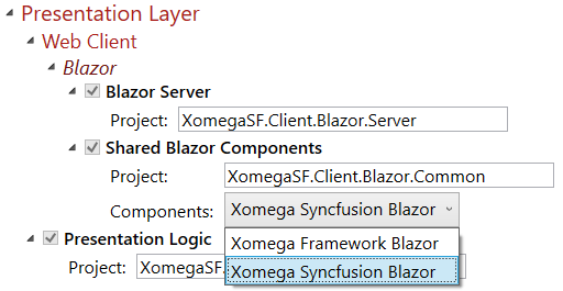
This will set up Syncfusion initialization code and will enable the
Syncfusion Blazor Views generator. If you don't have any
Syncfusion-specific UI customizations, you will be able to easily switch
between the Xomega standard and Syncfusion components to see the
difference.
Syncfusion Blazor components
Here is an example of the generated master-details Sales Order list and
details forms using Syncfusion components with bootstrap 4 style.

While it may look very similar to the standard Xomega Blazor components,
you can notice that it uses the Syncfusion’s MultiSelect control for
selecting multiple sales reasons, since the Pick List control is not
available in the Syncfusion framework.
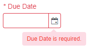
Also the validation message for invalid fields is displayed as a tooltip
on invalid controls rather than under the field, in order to be consistent
with the grid editing, as shown below.
Syncfusion editable grids
We have enhanced Xomega Framework to support fully-featured inline grid
row editing using Syncfusion’s grid. You can still write the platform
independent UI logic in your presentation layer data objects, and just
bind them to an editable grid.
For example, here is a screenshot of our updated sample, where we enabled
editing of the line items of a sales order directly in the grid.

The list of products is automatically displayed as a dropdown, and the
items in the Special Offer list depend on the selected product. So does
the price, which is not editable and grayed out, just as other calculated
fields like the discount (which is based on the special offer) and the
total amount.
If you try to update the row with invalid fields, the validation errors
will be shown under those fields. All this presentation logic is defined
in reusable list data objects and data properties, which you can test
independently, and use with various UI technologies.
Conclusion
As you have seen from the above, the new Xomega release introduces a ton
of new cool features for generated Blazor apps - from upgrading to
Bootstrap styles and layouts, to supporting powerful Syncfusion Blazor
components.
This will allow you to generate and build modern and complete apps in no
time with little to no coding. We are planning to keep improving Xomega
platform and its documentation to minimize the learning curve for you, but
feel free to download and check out the new release now, and let us know
should you have any questions or issues.

